Blog
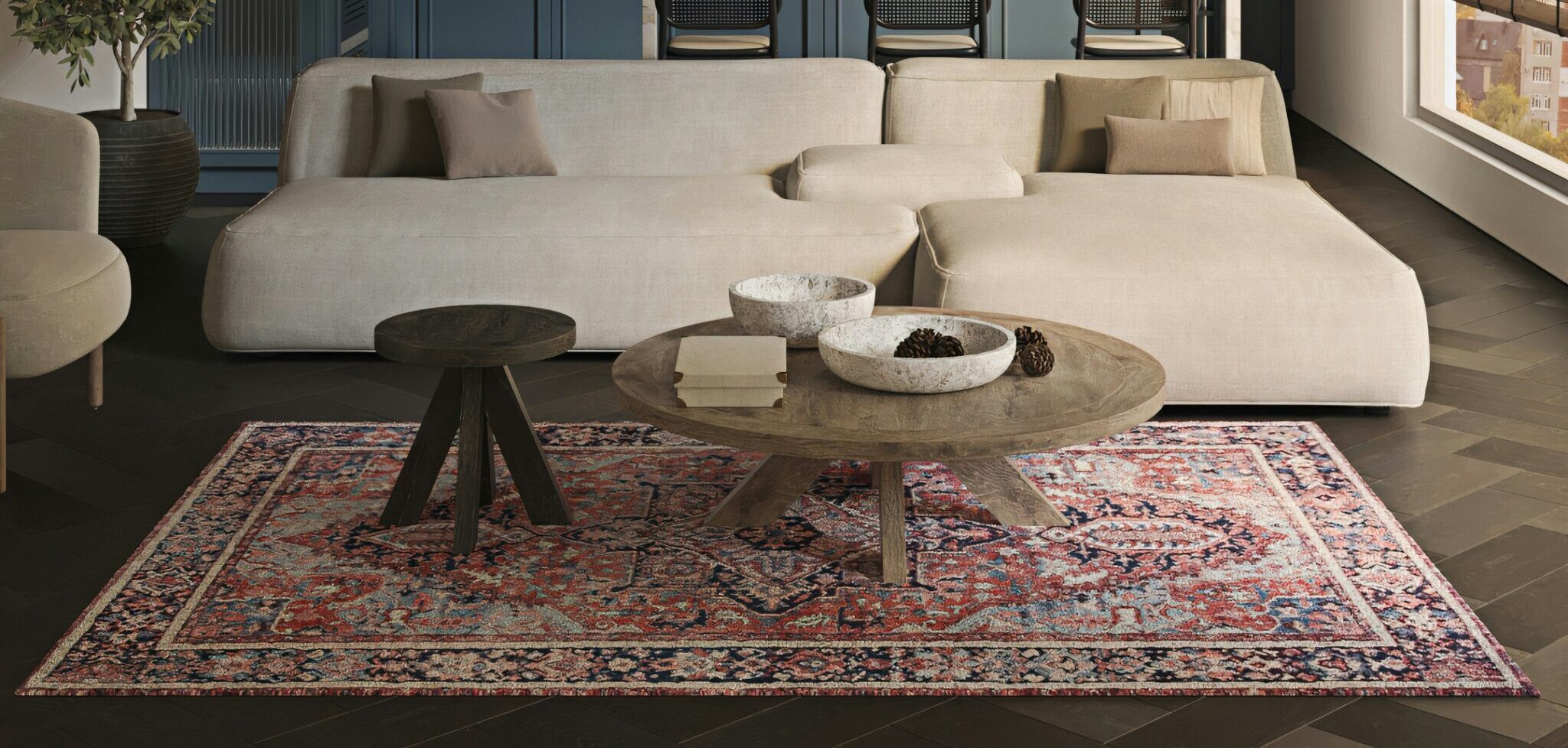
A coarse wool rug against a polished marble floor, or a light-coloured sofa set against a dark wall — these are the details that make an interior truly captivating. In interior design, contrast is not about creating disorder. It is about bringing opposites together with intention. When two different elements sit side by side, each can make the other stand out. Let’s explore the different ways to use this principle throughout your home.
Light and dark, cool and warm
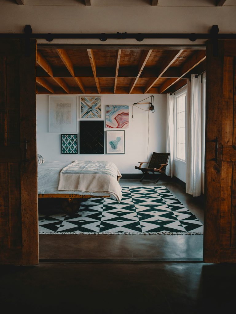
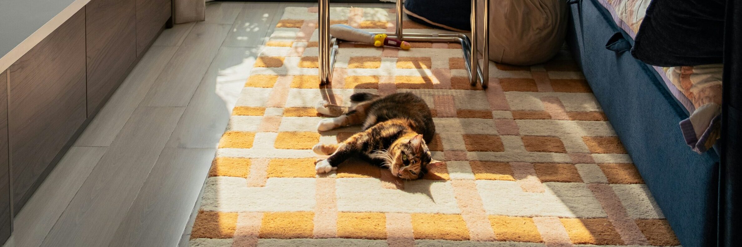
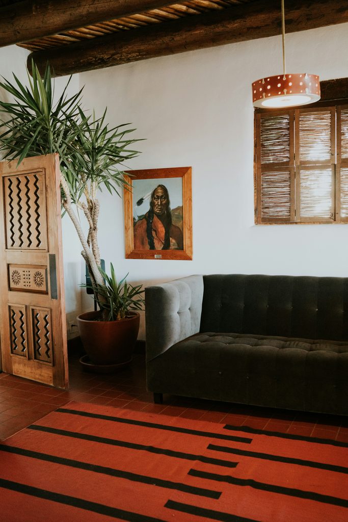
A room decorated entirely in light or dark tones can easily feel flat, even when the materials are beautiful. A dark piece of furniture or a striking dark rug adds instant depth against light floors and walls. The reverse works just as well. A light rug brings a sense of breathing space to a darker, more substantial interior.Pairing cool and warm tones follows a similar principle. Terracotta or rust-coloured accents bring energy to a palette of cool blues and greys. Neither side overwhelms the room, allowing the colours to complement each other. A cool-toned rug can also be balanced with warm wood furniture or copper accessories. This makes the room feel more inviting without losing its clean, refined look.
Old and new, matte and glossy
A vintage piece placed alongside modern furniture instantly adds history and depth to a room. We explored this idea in more detail in an earlier article. The same principle applies to finishes. A matte rug or textile creates an appealing contrast beside glossy lacquered furniture or glass surfaces.
When every surface is matte, a room can quickly feel dull. Too many glossy finishes, on the other hand, can make it feel cold and more like a showroom than a home. A thoughtful mix of the two creates a more engaging interior. For example, a matte wool rug beside a polished marble table grounds the space while preserving its elegance.
Rough and smooth: the interplay of textures
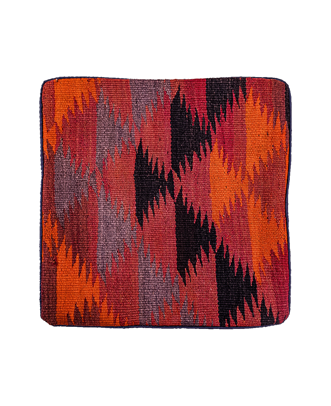
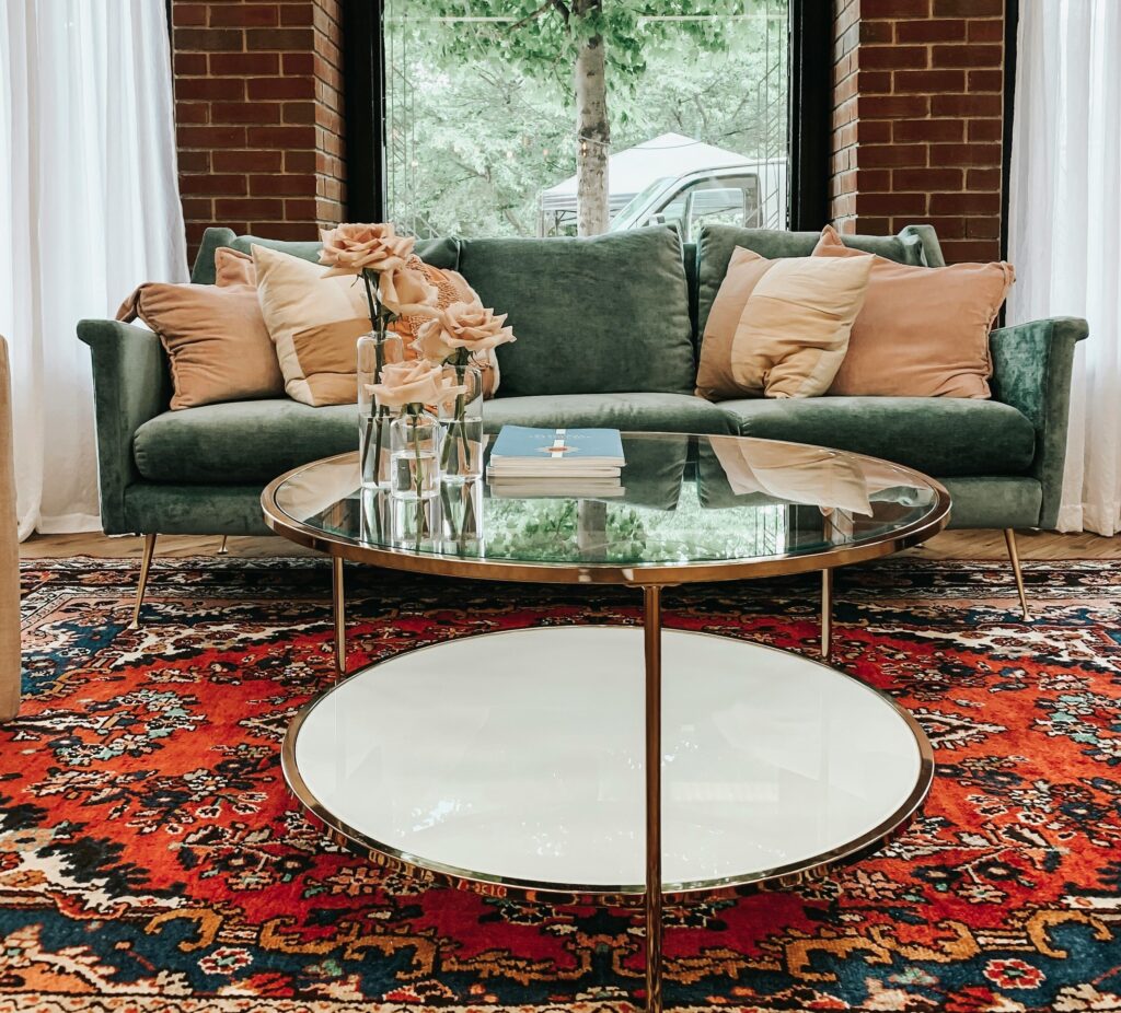
Texture appeals not only to the eye, but also to the sense of touch. A coarsely woven jute or thick wool rug feels richer when paired with silky cushions or smooth leather furniture. Each material also gains more character through this contrast. Raw brick walls and stone surfaces work beautifully alongside soft, tactile textiles. The aim is not to give every surface a different texture. Instead, introduce at least one strong textural contrast. This is what makes a room feel engaging to the touch, not just visually appealing.
Organic and geometric shapes
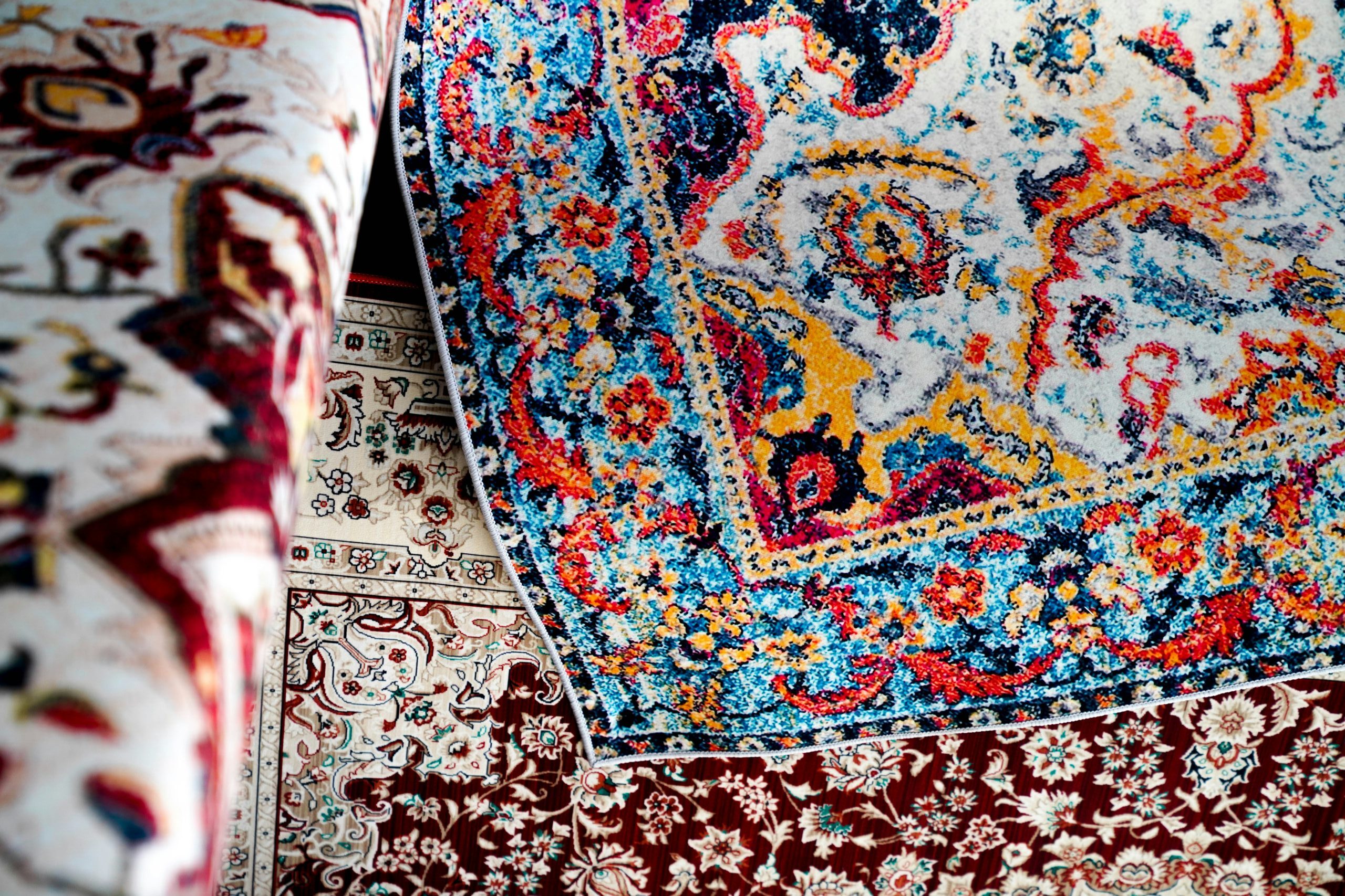
Shape influences the mood of a room just as much as colour or texture. A round or irregularly shaped rug softens the look of angular furniture. Conversely, a geometric rug brings structure and definition to furniture with rounded edges and flowing lines. When straight lines dominate an entire room, the result can feel rigid. Fill the space with nothing but curves, and it may lose its sense of structure. A considered balance between the two creates a more interesting interior.
A subtle backdrop, one standout feature
One of the most reliable ways to use contrast is to keep the background calm and let a single element take centre stage. Neutral walls, simple furniture silhouettes and understated lighting create the perfect setting for a striking patterned rug. Sometimes, this one piece is all a room needs to express its personality. The same principle works with other features, too. A distinctive light fitting, a boldly coloured armchair or a striking work of art can take centre stage. The key is to let the remaining elements support the overall composition. Furniture shapes, wall colours and lighting tones should stay in the background, allowing the chosen focal point — often the rug — to truly shine.