Blog
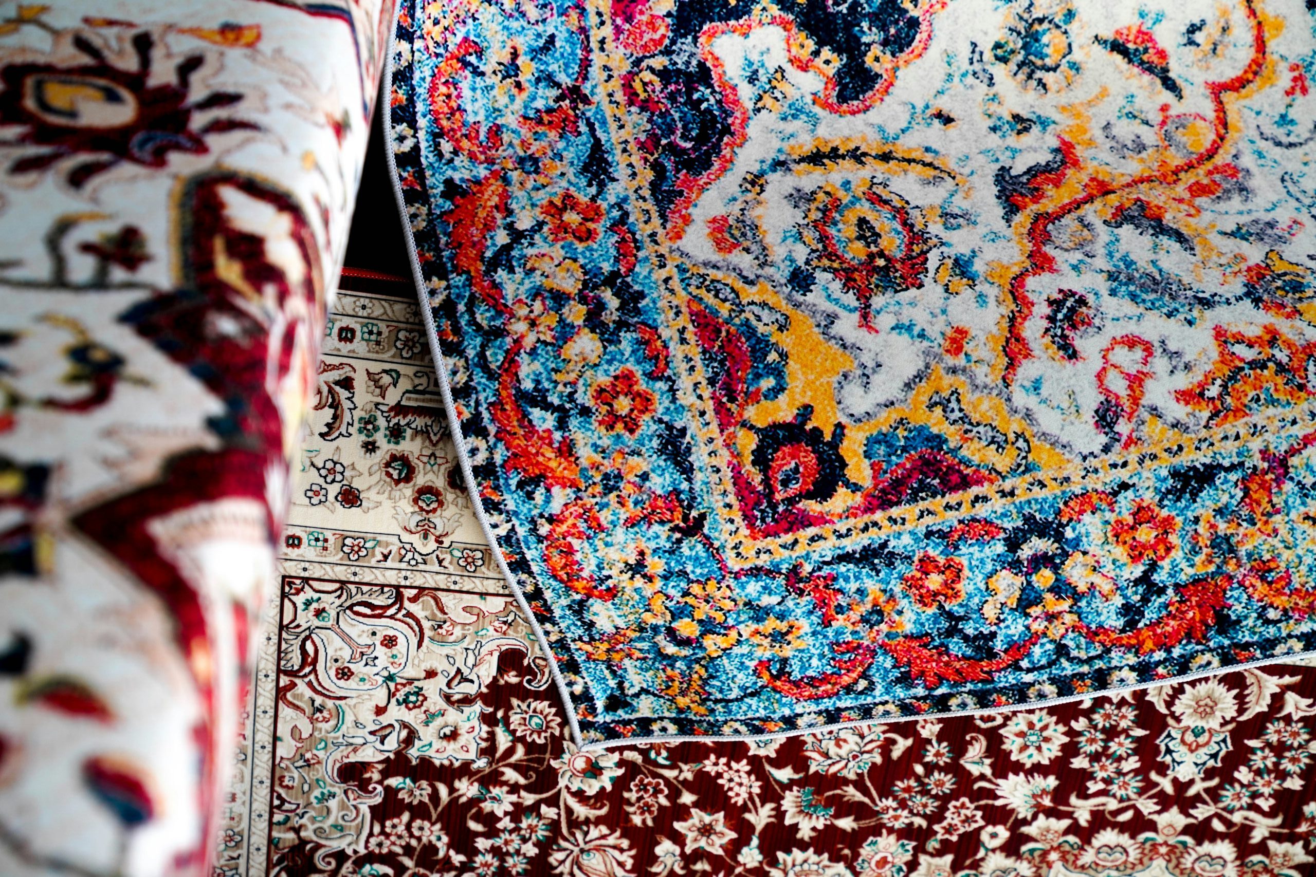
A harmonious colour palette has three layers: a base colour, a secondary colour and an accent colour. Each plays a distinct role in the overall design. Planning this combination on paper may seem straightforward, yet the results can be disappointing once everything comes together in the room. The reason is simple: light constantly changes the way colours appear, depending on the room’s orientation and the time of day. Colours also need proper care to retain their original appearance over the years.
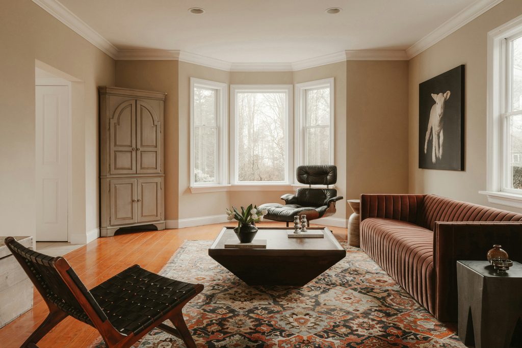
Base, secondary and accent colours: the three layers of a palette
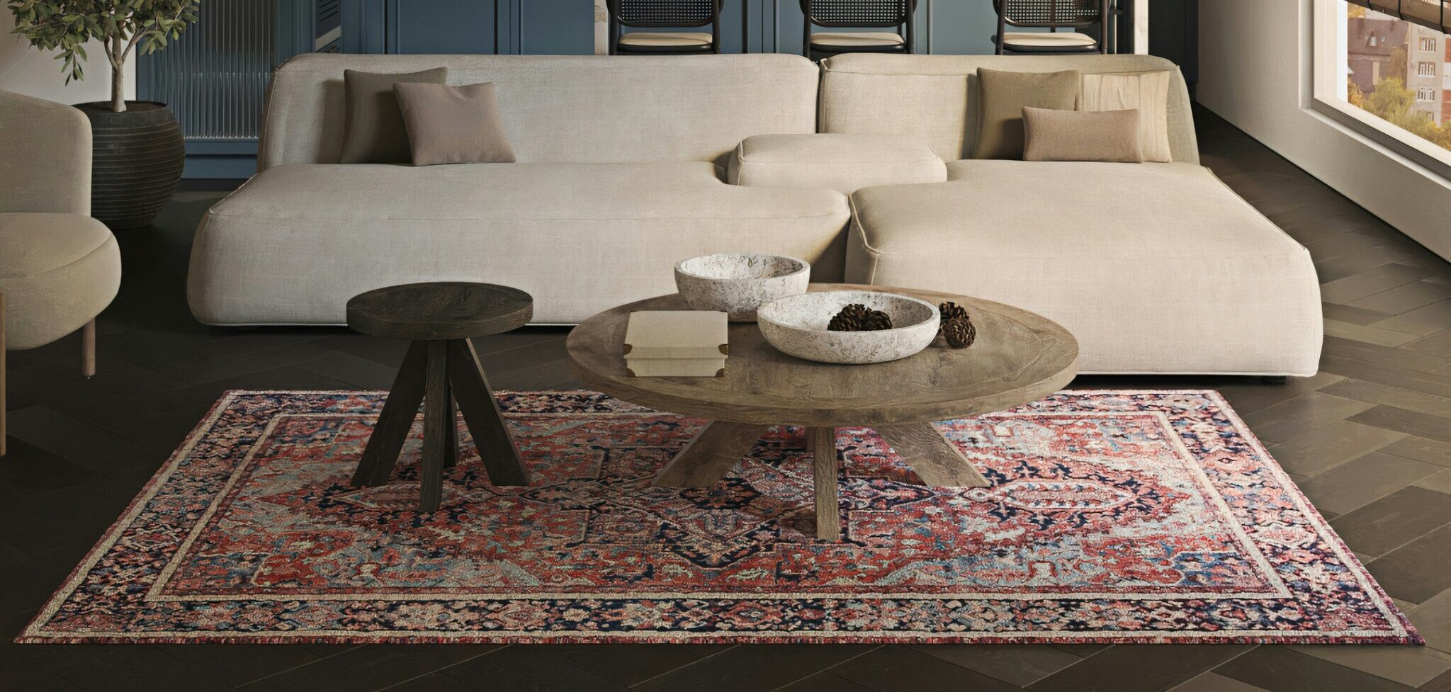
The base colour covers the largest surfaces, including walls, floors and larger pieces of furniture. It is best to choose a calm, understated shade. This creates the backdrop that brings the rest of the room together. The secondary colour appears on smaller surfaces, such as curtains, an armchair or a large rug. It adds depth to the interior. This shade can be bolder than the base colour, but it should not compete with it. The accent colour appears in the smallest amounts, yet often makes the strongest impression. Think of a decorative cushion, a vase or a piece of artwork. Its limited presence is precisely what makes it so effective. If it appeared everywhere, it would lose its impact. The best starting point is not the latest trend, but a closer look at your own tastes. A favourite piece of clothing, a travel photograph or the colours in a work of art can inspire a more personal palette than a ready-made colour scheme.
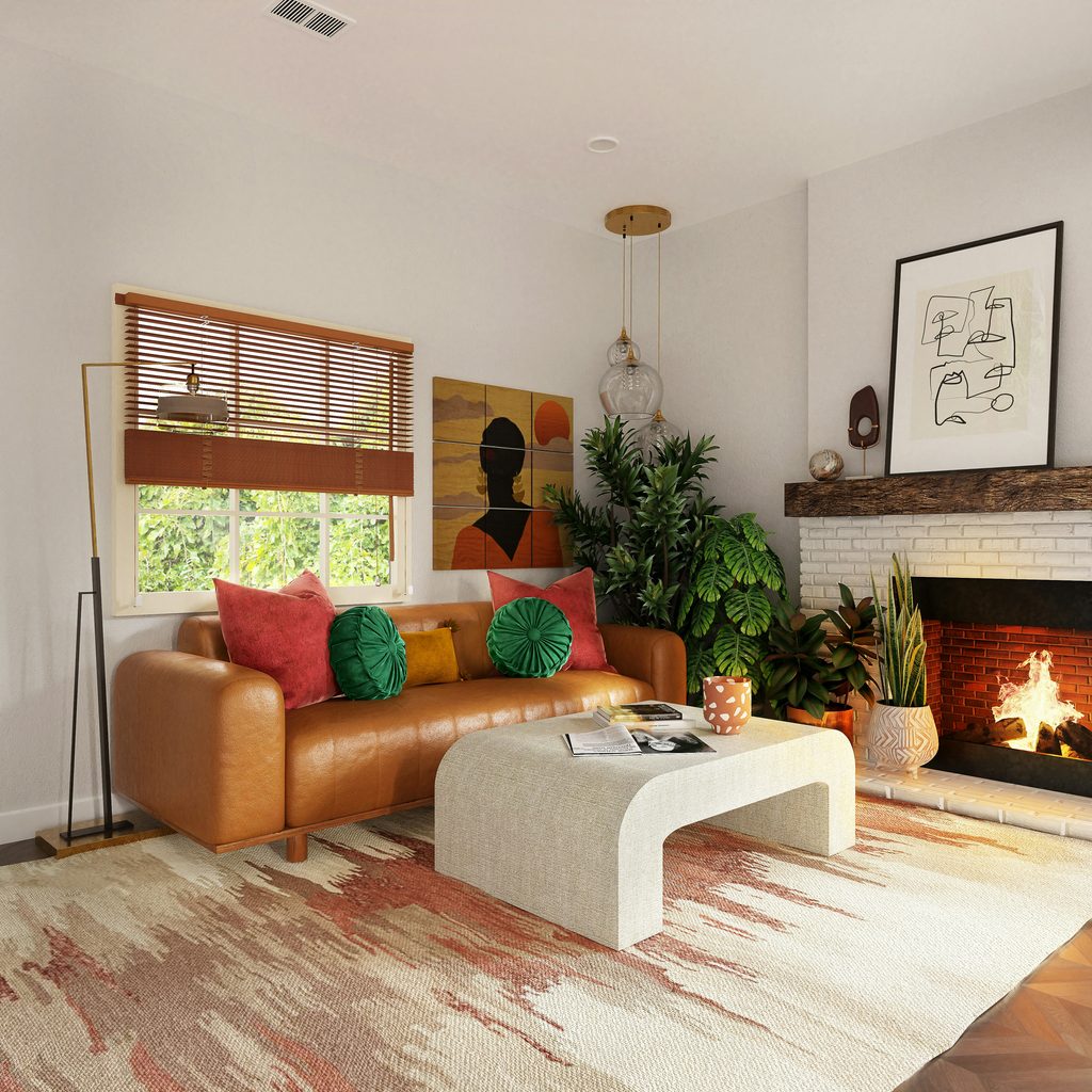
Room orientation and light: how we really perceive colour
The same colour can look completely different depending on the room’s orientation. North-facing rooms receive cooler, more even daylight. Blue, grey and other cool shades tend to work well in these conditions. Warm tones, however, can easily appear faded or muted.
South-facing rooms receive more direct, warmer sunlight. This brings out the richness of yellow, red and orange shades. Cool colours, on the other hand, may look washed out in this light.
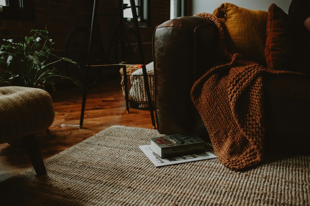
Natural light also changes throughout the day. The same colour can look quite different in the morning, early afternoon or at dusk. In the evening, artificial lighting transforms the room once again.
A warm light source shifts colours towards yellow and orange. Cooler white lighting has the opposite effect. That is why it is worth viewing rug or fabric samples in your own home, at different times of day and under both natural and artificial light. This simple step can help you make a more confident choice.
Preserving colour: practical care tips
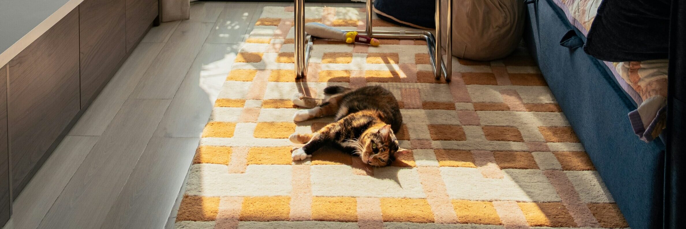
Even a carefully chosen colour will not stay unchanged forever without proper care. One of the simplest and most effective ways to protect a rug is to rotate it by 180 degrees every six months. This helps areas exposed to sunlight and regular foot traffic wear more evenly. It also reduces the risk of noticeable fading on the side that receives the most sunlight.
Light-filtering curtains provide another layer of protection. They reduce direct UV exposure without blocking all the natural light entering the room.
Material quality also makes a difference over time. A well-made rug with UV-resistant, washable fibres can retain its colour more faithfully. The difference is particularly noticeable in a sunny, south-facing room, compared with a rug made from lower-quality materials.
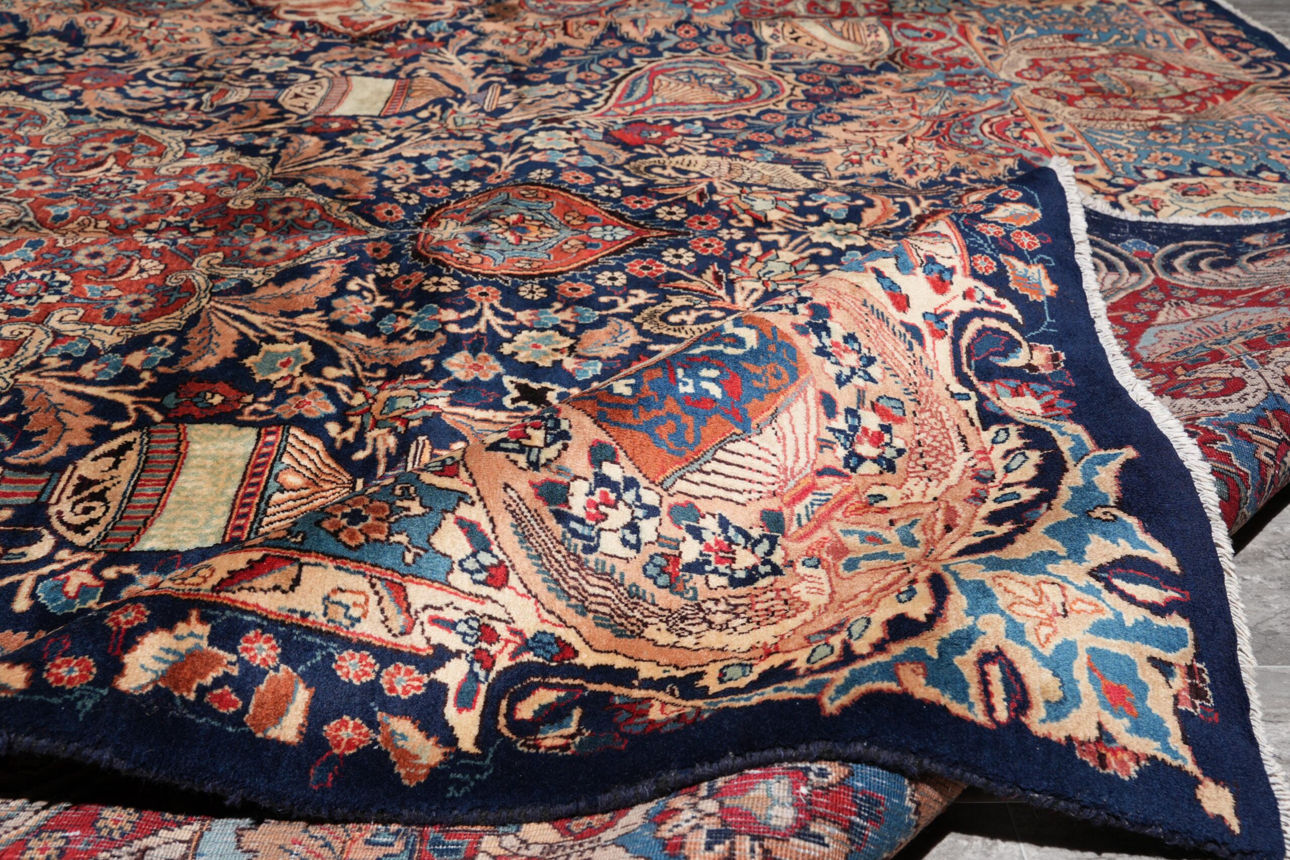
Before making your final colour choices, remember one important principle. A rug sample can look very different in a showroom than it does at home, under your own lighting conditions. Testing the sample in the actual room is always worthwhile before settling on your final choice.