Revealing colours – green

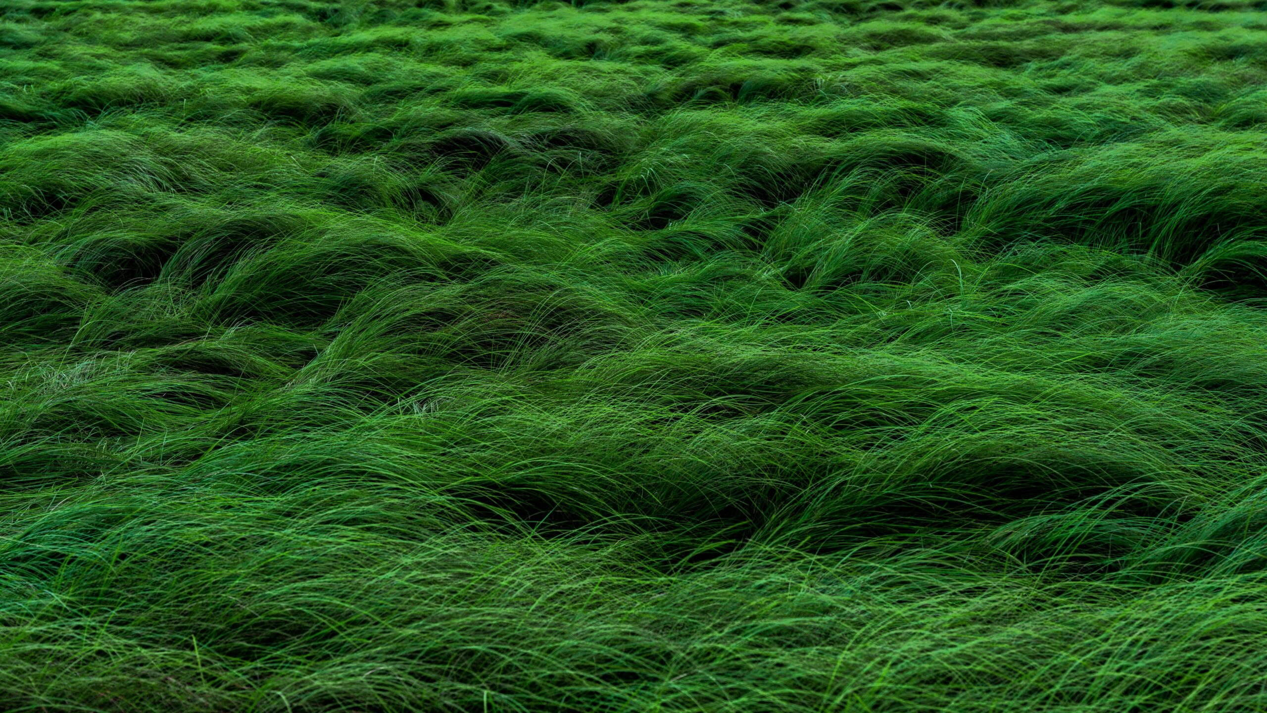
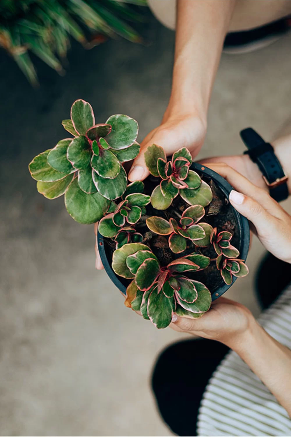
As the colour of nature, green evokes renewal, harmony and balance, while its different shades can express a wide range of emotions and meanings.

  • It represents spring, the renewal of nature and growing life.
  • Evergreen plants in particular are associated with symbolism of fertility and immortality.
  • Green stands in the “middle” of the colour spectrum, with red as its complementary colour. As a mixture of blue and yellow, it also represents a threefold relationship between colours. This gives green a dual meaning: it can symbolise youth, hope and happiness, but also change, transience and jealousy.
  • It combines warmth and cold, as well as the heavenly and the earthly.
  • It can also symbolise immaturity, inexperience and naivety.
  • In Christianity, green is the colour of immortality and resurrection, and among the Virtues it represents Hope.
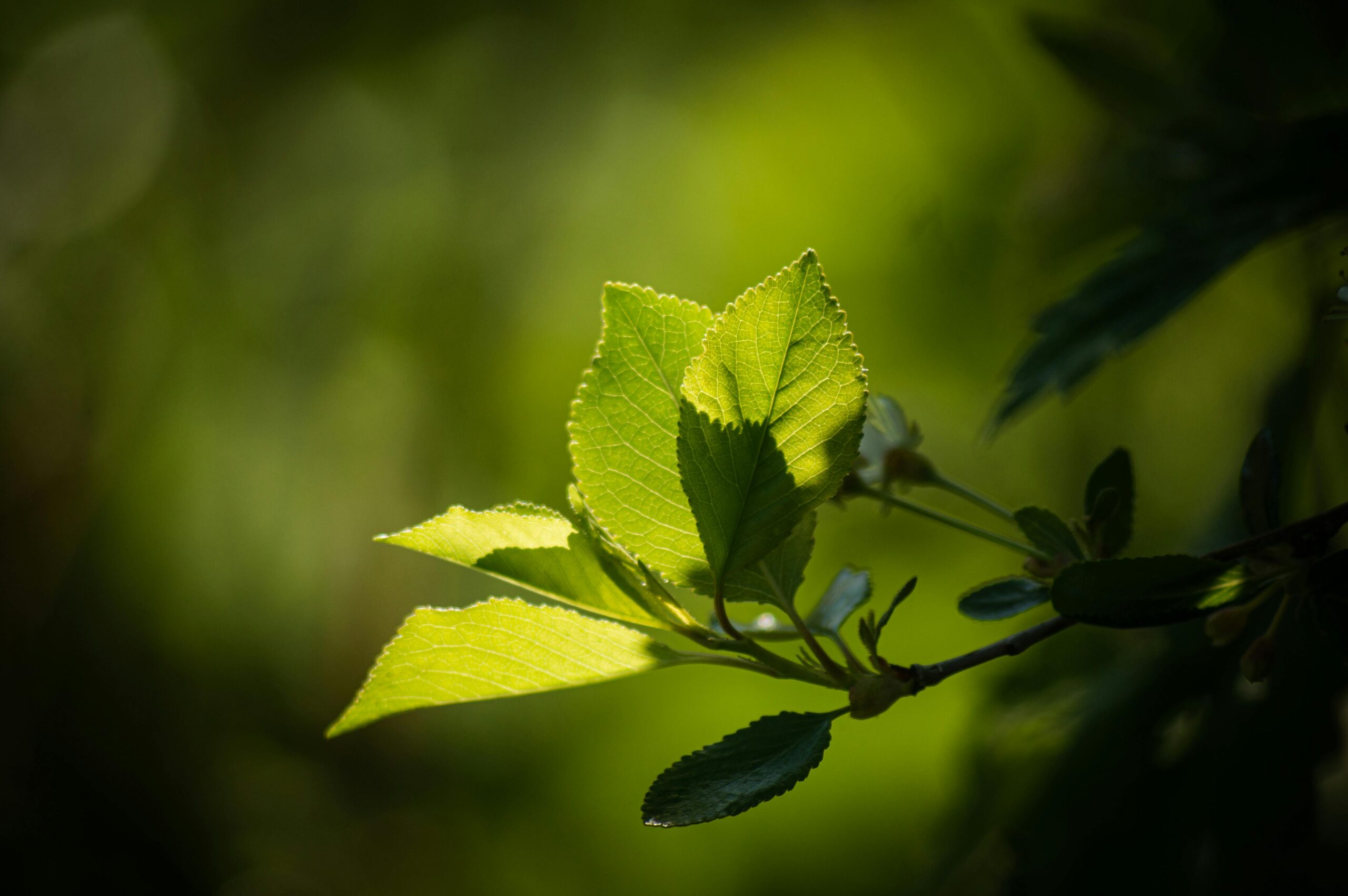
In heraldry, green can represent growth and hope. Green is also the opposite of red in safety signalling; for example, it indicates that it is safe to cross the road. It is widely used to represent safety and can also appear on medicines and medical products. Green is closely associated with nature, which is why it is often used to advertise environmentally friendly or “green” products.

Muted dark green is often associated with money, the material world, banks and Wall Street. Dark green can also suggest ambition, greed and jealousy. Yellow-green is linked to illness, cowardice, conflict and jealousy. Seaweed green is associated with emotional healing and protection. Olive green is traditionally a colour of peace, as reflected in organisations such as Greenpeace.

Szeretne elsőként értesülni a legújabb híreinkről és linformációinkról?

Cikkeink hasonló témában

Contrast in interior design: a play of light, texture and form

Contrast brings depth and character to interior design through carefully chosen opposites, from light and dark tones to old and new pieces or contrasting textures. Discover how to combine colours, shapes and surfaces so that a statement rug or another standout feature truly shines.

A harmonious colour palette for your home: the role of base, secondary and accent colours

A harmonious home colour palette combines a carefully chosen base colour, a secondary colour and an accent colour to give a room its character. Discover how room orientation and natural light affect the way we perceive colour, along with simple ways to preserve the original colours of your rugs for years to come.

More Space in a Compact Home: Practical Decorating Ideas for Smaller Apartments

A smaller apartment can feel airier and more open with a few thoughtful decorating choices. A well-sized rug, layered lighting, mirrors, multifunctional furniture and zones without walls can all help a compact home feel more practical and harmonious.

Ezek érdekelhetnek még

Ez is érdekes lehet

What is the secret behind the lasting success of KABIRI Carpet?

×
×

Cart